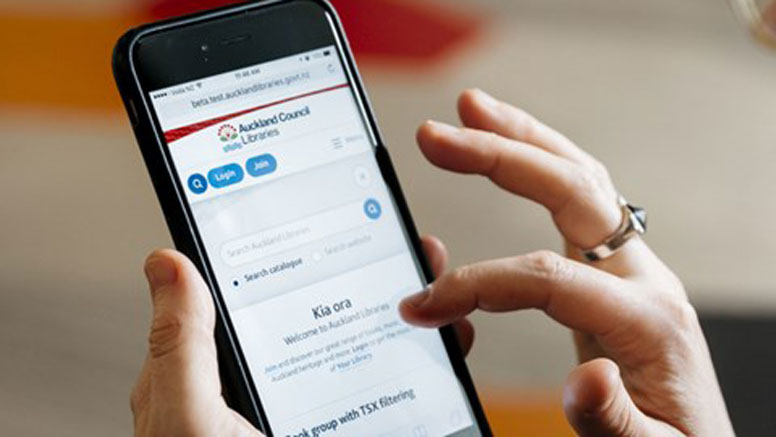
Designing the accessible library website
Good design is just as important when creating user-focused and accessible websites as it is for physical spaces. Auckland NZ just launched its new site.
31 Aug 2017

The new site from Auckland, New Zealand, is designed to respond to current user needs for mobile access, with an eye on potential future developments.
Mirla Edmundson, General Manager Libraries and Information, says that the new site signals a new milestone in customer service:
“The current website has up to 20,000 views a day, and it was really important for us to deliver an intuitive and accessible experience for our customers.
“This first stage makes it easy for customers to find the content that matters most to them, and future development will deliver options for more personalised experiences.”
Key features are:
- Simple navigation that makes it easy to access the library catalogue, eBooks and eMagazines, databases and heritage resources, as well as find out what’s happening at your community library.
- Clean layout and built using universal design principles.
- Content is written in plain English and based on what customers are using and looking for.
The events pages are particularly impressive.
The library service is looking for feedback from its customers, but no doubt will appreciate constructive comment from an international library colleagues.